
Color-coordinating curtains: How to create harmony in the room
Curtains are an essential element of interior design. They protect against the sun and prying eyes – and they shape the overall atmosphere of the room. Color selection plays a key role in ensuring that curtains and furnishings create a harmonious overall look.
01 | Pick up the wall color
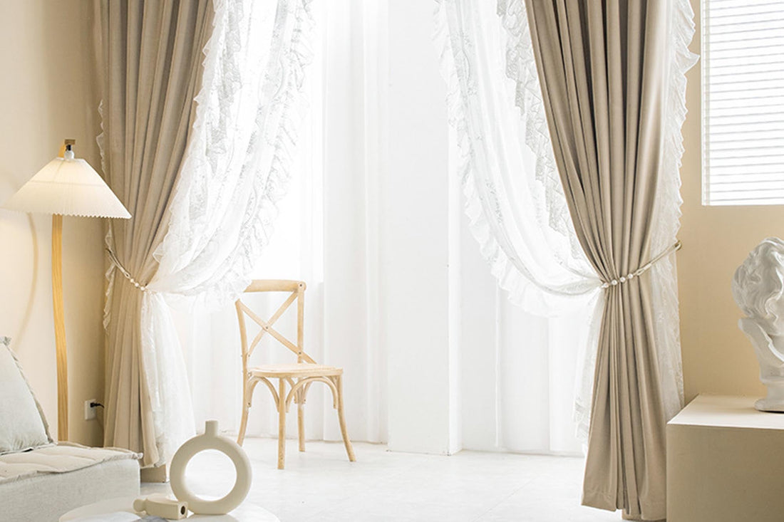
A simple and elegant option: Choose curtains in the same or a similar color as the wall—but with a different color depth. For example, if the wall is painted light blue, dark blue or blue-gray curtains will look particularly harmonious.

02 | Furniture and accessories as reference
If you're unsure, take your pick from existing furniture and textiles. Rugs, sofas, pillows, or bedding can all dictate the color palette. For example, if there's a red carpet in the living room, curtains in red or a related shade will match it perfectly. This creates a confident and harmonious combination.
03 | Choose a style that matches your interior
Every interior design style has its own color language:
- Modern and minimalist: white, grey or black for clear elegance.
- Country house style: beige, light yellow or soft green for comfort and naturalness.
- Scandinavian: Light, neutral tones combined with pastel colors.
It is important to match the color of the curtains to the overall mood of the interior.

04 | Consider the lighting effect
Curtains influence the lighting mood of the room:
- Light colors reflect more light and make rooms appear larger and friendlier.
- Dark colors absorb light and create a cozier, more intimate atmosphere.
The choice of color should therefore not only match the furnishings, but also the desired lighting effect.

The right choice of curtain color creates harmony, depth, and a sense of well-being. Whether inspired by wall colors, coordinated with furniture, or matching the interior design style – the key is the combination of function, effect, and personal taste. This creates rooms that are not only stylish but also individual.