
Color Psychology: How Curtain Colors Affect Your Mood
Curtains are more than just decoration—they shape the light, the mood, and the feeling of security. With the right color, you can direct the energy in a room: calming, invigorating, or cozy warmth.

Why colors change feelings
Colors have an impact through associations, contrasts, and light reflection. Large, matte colored surfaces (e.g., curtains) are particularly influential because they scatter light and define the window's visual frame.
- Brightness controls tension: darker = more sheltered, brighter = more open.
- Temperature (cool/warm) controls activation: cool = organizing, warm = inviting.
- Material (matte/glossy) controls focus: matte calms, gloss accentuates.
Color effects at a glance
Blue – Clarity & Calm
Misty and gray-blue shades are calming and orderly. Ideal for the bedroom and home office when concentration is required. Blue appears lighter with voile, and as a dim-out shade, it adds depth in the evening.
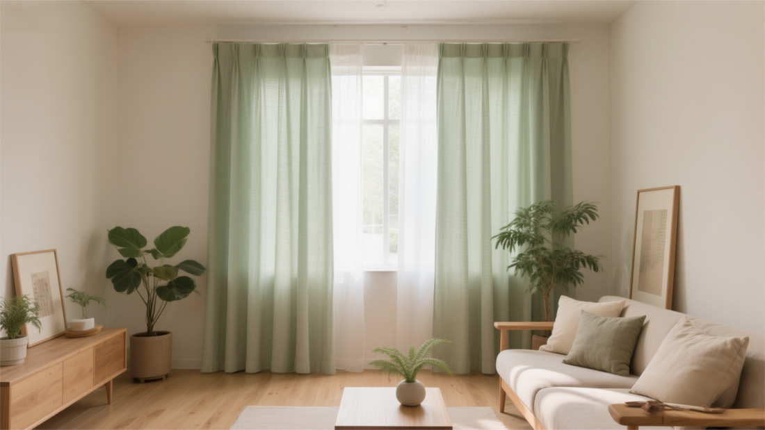
Green – Nature & Regeneration
Sage, eucalyptus, and moss green convey freshness and relaxation. Perfect for the living room and bathroom—combined with wood and plants, they create an "indoor garden" feeling.

Beige/Taupe – Warmth & Security
Sand, oat, and warm taupe tones create a soft, cozy feel and work well in any room. Velvet creates an elegant look, while linen looks relaxed and casual.

Rosé/Dusty Pink – Gentleness & Closeness
A subtle blend creates a harmonious effect, especially in bedrooms and reading corners. Modern with gray tones, warm with brass details.
Shades of gray – calm & structure
Light grays create visual order and allow accessories to stand out. In north-facing rooms, warm tones (greige) are recommended to avoid a chill.
Room & time of day: finding the right color
bedroom
Blue and green tones for tranquility; dim/black out shades in the evening. Balance light floors with medium shades of drapery.
Living room
Beige, greige, or soft sage for instant comfort. Heavy fabrics (velvet) add depth; voile underlays keep the day pleasant.
Dining area
Warm neutrals (beige/taupe) promote conviviality. Subtle pink accents add softness without appearing playful.
bathroom
Fresh green or misty blue tones, moisture-resistant qualities; semi-transparent for privacy and light.
Home Office
Cooler, muted tones (gray-blue, sage) promote focus. Matte surfaces reduce glare on the screen.
Light & fabric: how to keep the color “right”
- Orientation: Northern light is cool—choose warmer shades (greige instead of gray). Southern light is warm—cool tones become clearer.
- Texture: Velvet deepens colors, voile brightens them, linen look breaks the saturation.
- Gloss level: Matt calms, satin/gloss emphasizes – usually choose matt for bedrooms and work rooms.
Building pallets: 60–30–10 rule
Proven for harmonious looks:
- 60% base color: wall/floor/carpet (e.g. warm off-white).
- 30% Secondary: Curtains/soft furnishings (e.g. sage green or mist blue).
- 10% Accent: Pillows/metal/objects (brass, clay, dark wood).
Tip: Monochrome (a color in shades of brightness) appears calm; analog (e.g., blue-green) fresh; complementary (e.g., blue-warm beige) vibrant – keep the saturation low for complementary.

Decide: test instead of guess
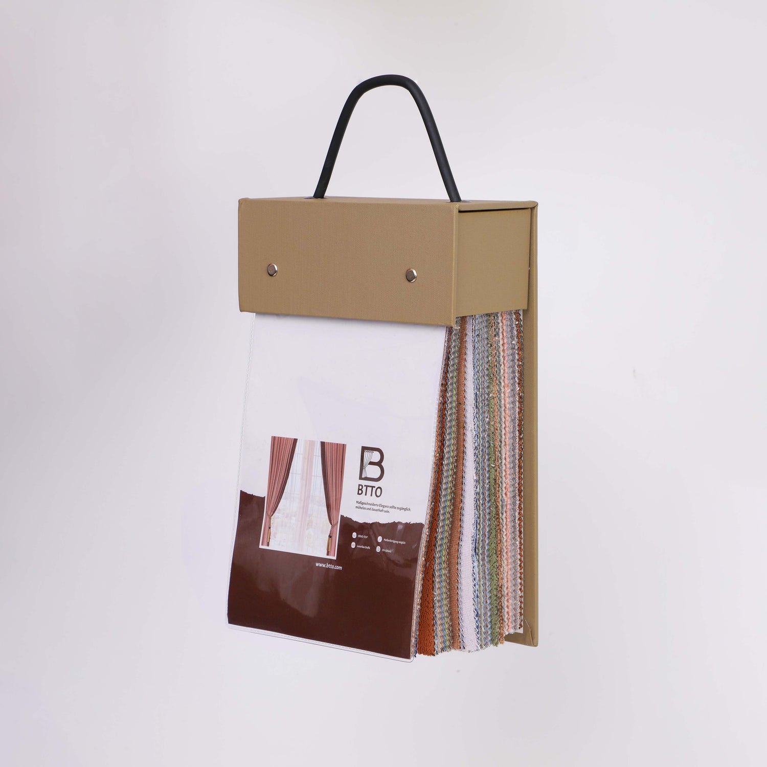
- Check the pattern at the window: Place fabric samples next to each other, check in daylight and in the evening against artificial light.
- Photo comparison: morning/midday/evening cell phone photos – evaluating color in everyday life.
- Simulate combination: Hold a curtain sample next to the sofa/headboard/rug – check for harmony.
Avoid common mistakes
- Too cold blue in the north-facing room: balance with warm neutrals (greige, wood).
- Too many accents: One accent color is enough – otherwise it becomes cluttered.
- Shiny fabrics in the work area: prefer matte to avoid reflections and visual disturbance.
- Color decided only on the sample: always think in the original size of the window – curtains are large surfaces.
Checklist: Your color decision
- [ ] Room function clear (calm, focus, sociability)
- [ ] Direction & light checked
- [ ] Material selected (matt/transparent/deep)
- [ ] Palette built according to 60–30–10
- [ ] Samples tested in daylight & artificial light
- [ ] Accents reduced & deliberately set