

Natural colors and materials: inspiration for a harmonious home
Natural palettes are the most serene companions in everyday life. Sand, stone, wood, and leafy green create a sense of calm – curtains translate these qualities into large, soft surfaces that organize light and connect spaces.

1. Colour worlds from nature – systematically thought
- Soft Neutrals: Sand, Oat, Warm Greige – as a base for the living room/dining area.
- Green shades: sage, olive, eucalyptus – regenerating, ideal for sleep/bath.
- Stone & Earth: Taupe, clay, smoky grey – stability & depth.
Rule: It's better to have one color family with three brightness levels than five different colors. It's calming.
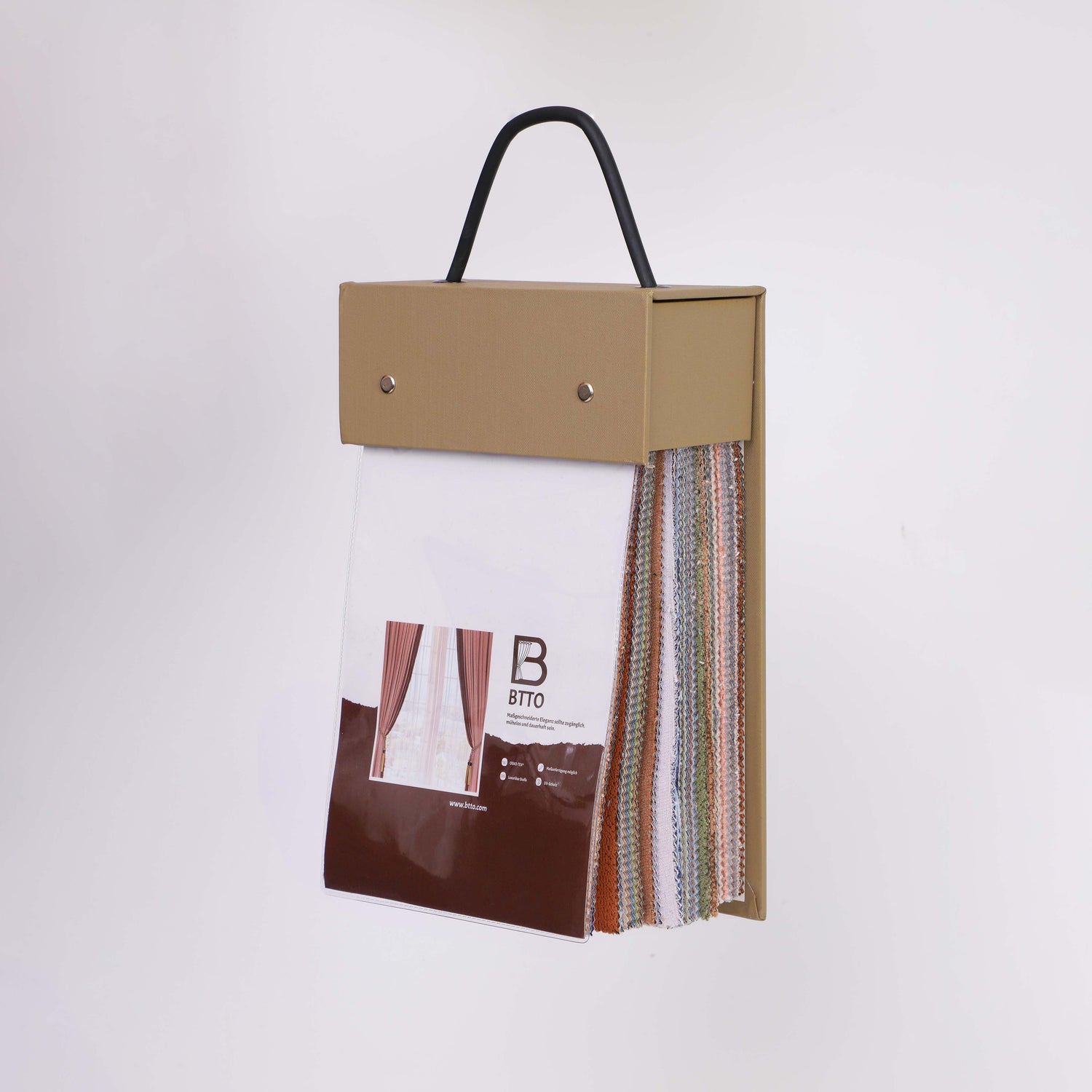
2. Materials & Haptics
- Linen look/twill: Gently diffuses light, reveals natural texture; suitable for everyday use and easy to care for.
- Velvet matt: Warms visually & acoustically, mature elegance without shine.
- Inbetween/Voile: Connects rooms during the day; ideal for daytime use. Collection

3. Composition: 60–30–10 & material mix
- 60% Base: Wall/Carpet (Off-White/Sand).
- 30% Secondary: Curtains/soft furnishings (sage/taupe).
- 10% accent: wood/brass/stone objects.
Mix: textile (linen look) + wood (oak) + stone (travertine) = calm, warm, timeless.

4. Room-typical pallets
Living room
Sand-colored in-between, greige sofa, wood/travertine table; dim-out in taupe slightly closed in the evening.
bedroom
Sage/greige, matte dim-out; off-white bedding, warm wood details; dimmed lights.

Bathroom/windowsill
Tightly woven inbetween (moisture tolerant), integrate plants (olive/fern) – “garden indoors”.
5. Measurement & Assembly
- Ceiling height, 15–25 cm overhang at the sides; calm, connected surfaces.
- Fold allowance 2.0–2.3 times for even waves.
- Conclusion: Kiss in walkways, short break in quiet zones.
6. Care & Longevity
- Gentle wash, low spin speed, hang damp.
- Air regularly, shake out dust, and gently brush velvet.
7. Common Errors & Solutions
- Too many accents: One accent material is enough (wood or brass) – not both dominant.
- Hard wall contrast: Curtains close to the wall color – room appears larger.
- Shiny fabrics: Reflections disturb the tranquility; prefer matte.
8. Mini-Case: From a colorful mix to a natural palette
Initial scenario: Colorful pillows, shiny rod, short curtains. Solution: Ceiling track + sand-colored in-between + taupe dim-out; reduced furniture; 2–3 natural accents. Result: More tranquility, a larger impression of space.