
Color choice for curtains: inspiration from nature, classics and the color wheel
Inspiration from nature
Nature demonstrates how harmonious color combinations emerge. The floor is usually dark (gray, brown, terracotta), plants add shades of green and color, and the sky appears light and airy. This principle can be applied to the home:
- Dark floors → light curtains as balance
- Bright, airy rooms → light fabrics in soft tones
- Darker color schemes → heavier fabrics that block or scatter light
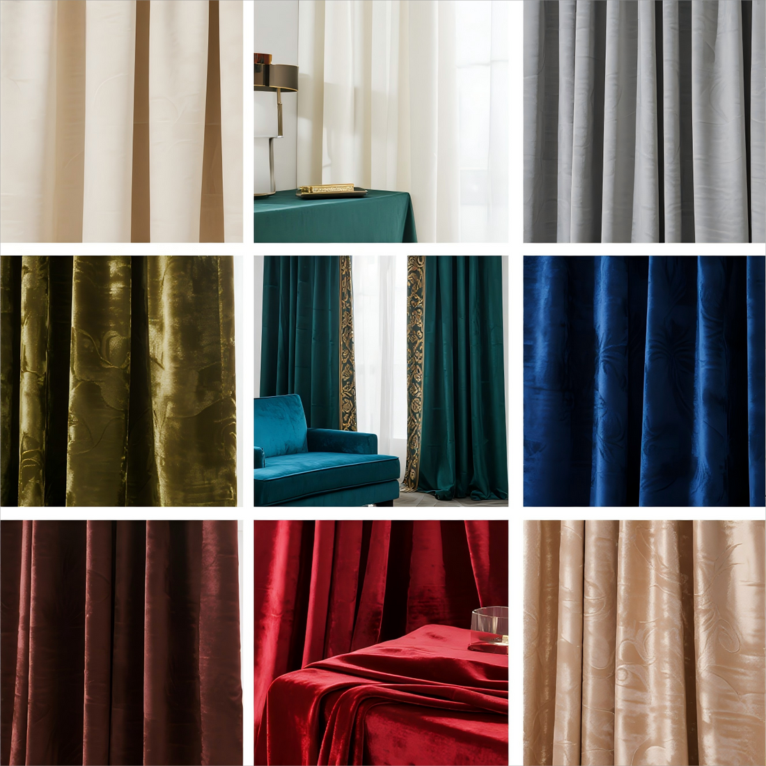
Timeless natural combinations include golden yellow with green, turquoise with sandy tones, or a vibrant cherry red as an accent. These curtains add energy without being overly oppressive.
Classic color combinations
Some color pairs never lose their impact:
- Black and white – elegant, contrasting, timeless
- Blue and white – versatile, from maritime-modern to traditional-cozy

- Orange and blue – complementary colors that create vibrancy and balance
- 60-30-10 rule – 60 percent primary color, 30 percent secondary color, 10 percent accent. Curtains can play a secondary or accent role here.
Use patterns and structures
Even in monochrome rooms, curtains with texture or pattern bring excitement:
- Floral motifs → romantic
- Chevron pattern → dynamic
- Toile → classic and elegant
- Damask → timeless and luxurious
Balance is key: Different patterns can be combined as long as the color palette remains harmonious. Uniform accessories like pillows or rugs prevent visual overload.

The color wheel as a design tool
The color wheel is a valuable helper:
- Complementary colors (opposites): Blue with orange, red with green, yellow with violet – intense and vibrant
- Analogous colors (neighbors): red with red-violet or blue with blue-green – soft and harmonious
- Neutral tones : grey, beige, black, white – they complete colour concepts or set clear accents
Curtains based on color wheels can either be discreetly integrated or deliberately act as an eye-catcher.
Warm and cool contrast
Colors influence moods:
- Cool tones (blue, green, purple) → calming, relaxing, ideal for bedrooms or bathrooms
- Warm tones (red, orange, yellow) → lively, cozy, perfect for dining and living areas
The secret lies in balance: combining cool walls with warm curtains, or vice versa. For example, burgundy in the dining room creates intimacy, while light blue in the bedroom promotes tranquility.
Decide based on your gut feeling
Rules help, but what matters is what feels right. Compare fabric samples at home, match them to the flooring and furniture, and consider the desired mood. Whether paisley patterns match wood floors or geometric patterns match plain walls, curtains should reflect your personality.
Conclusion
Curtains are a central element of interior design. They control light, add structure, and shape the character of a room. Whether inspired by nature, classic combinations, or the color wheel: with the right color choice, you can create harmony and expressiveness at the same time.
BTTO believes that every drape tells a story. Choose wisely – and let your curtains become the elegant backdrop of your home.